PHOTOGRAPHY BY DANIEL MOSS
At home with Felix Burrichter
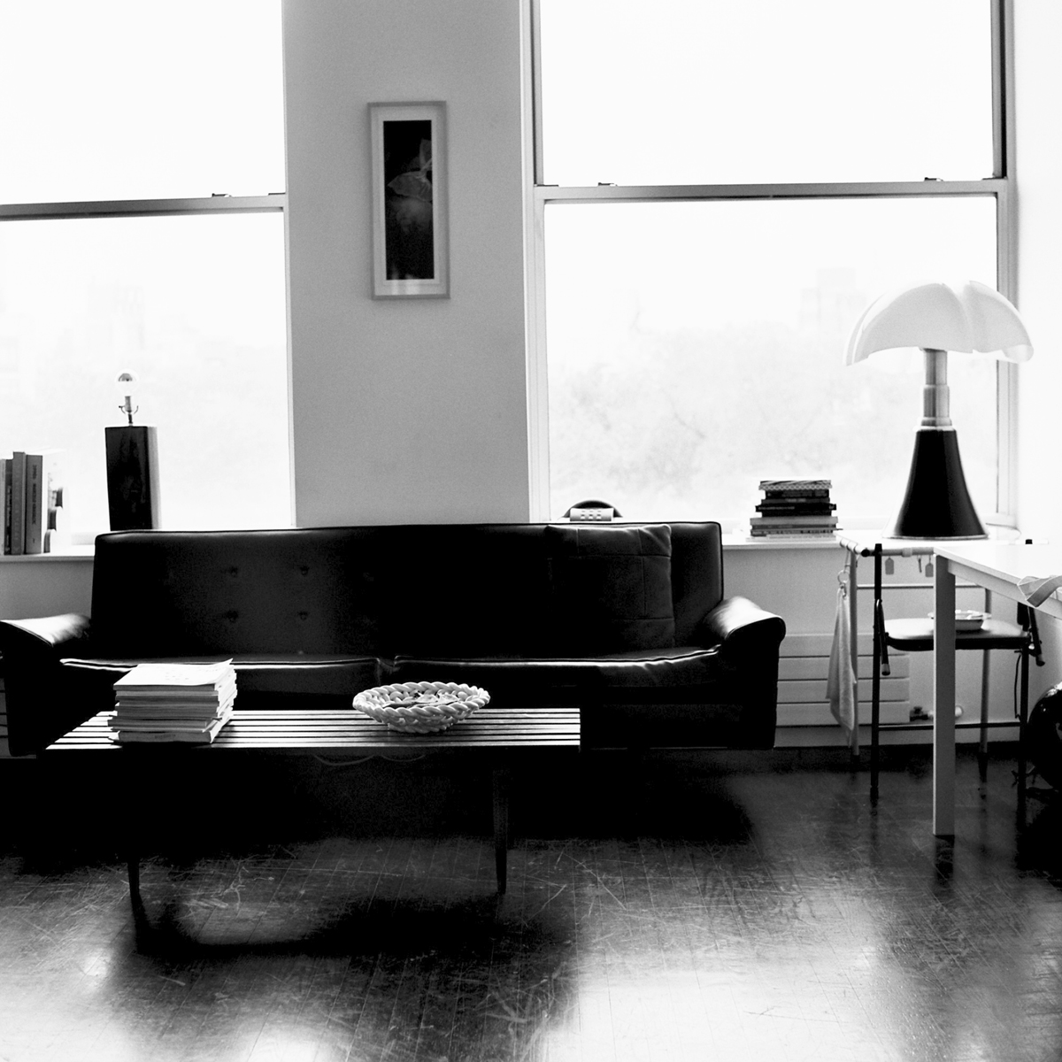
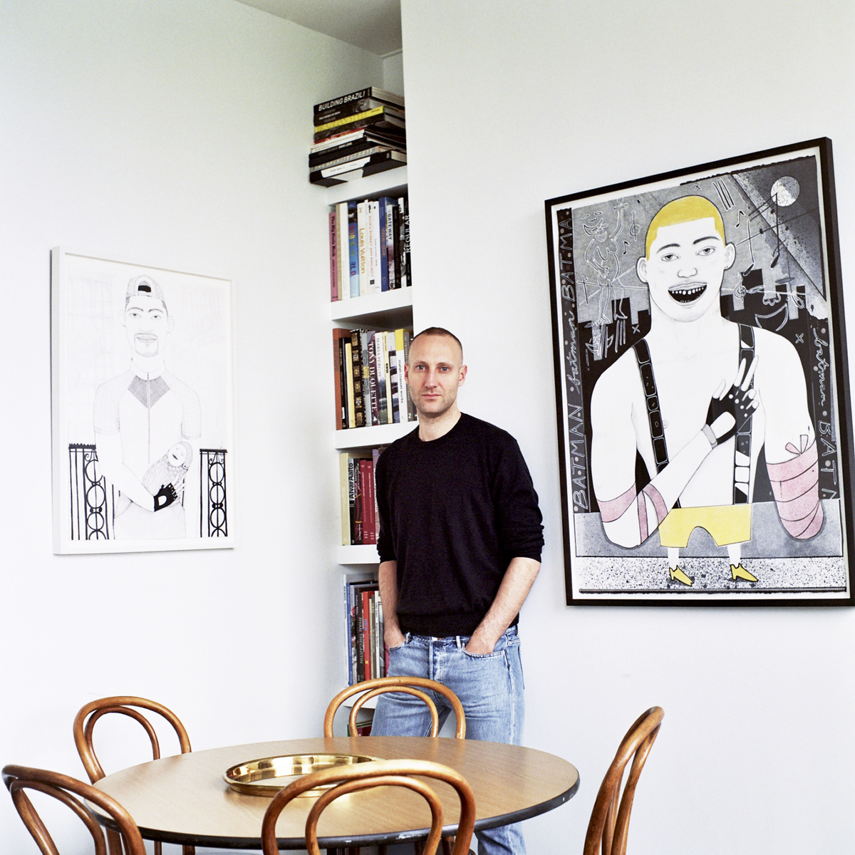
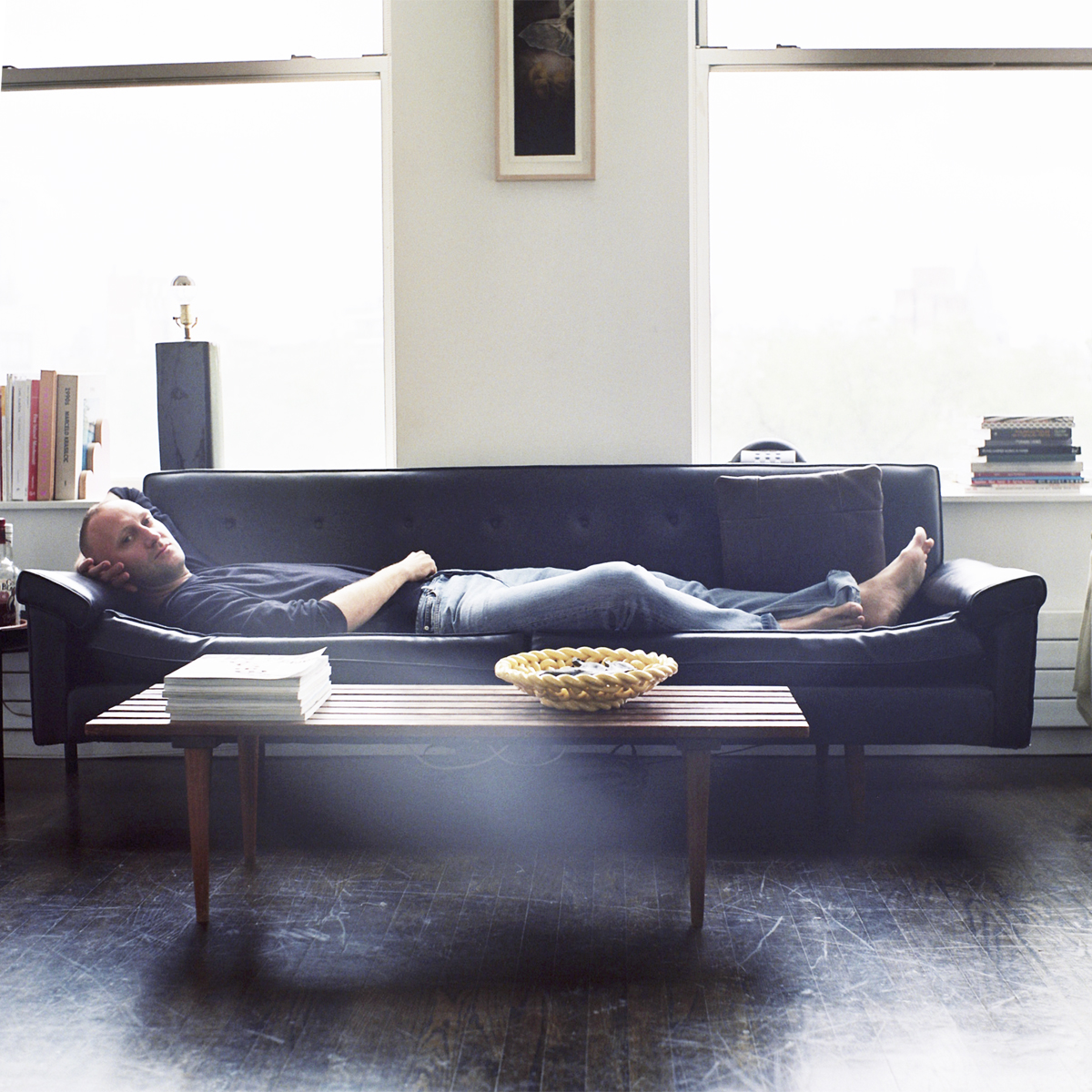
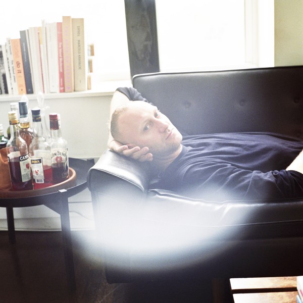
We recently visited Felix Burrichter‘s place in the Lower East Side of Manhattan. Felix is the creator of PIN-UP which he describes as “a magazine for architectural entertainment.” We had a chance to take some pictures of Felix while he was packing to go to Europe. We chatted about all sorts of things from ugly buildings, to alcohol, to Brazilian men to his brand new book PIN-UP Interviews (published by PowerHouse Books).
Where were you born? Düsseldorf, Germany.
Did you study architecture? Yes. First in Paris at ESA, then at Columbia University in New York.
How was PIN–UP born? After graduating from Columbia I was working at a corporate New York architecture firm. I was miserable drawing curtain walls for large casinos in Macau. In order to keep myself entertained I started thinking about what the ideal architecture magazine would look like, with its most voracious reader being me.
Why do you define the magazine as “architectural entertainment”? I chose “architectural entertainment” as PIN–UP’s subtitle as a way to differentiate it from most other, “serious” architecture trade magazines, with whom PIN–UP never set out to compete. If anything I like to think of PIN–UP as a guilty pleasure for architects, and as the initiation drug for those who never thought they’d be interested in it.
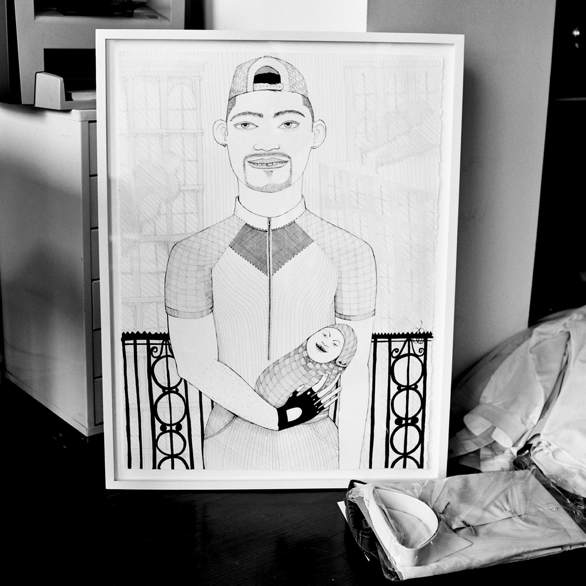
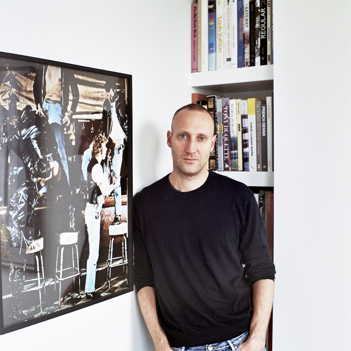 On wall: “Erotic Decorative Objects” by Dean Sameshima.
Do you get lots of free furniture? No.
You used to also edit BUTT magazine. What was the transition to creating a magazine about architecture like? PIN–UP actually started in late 2006, almost three years before I was asked to edit BUTT in 2009. So the transition happened the other way around. I did intern for BUTT (and Fantastic Man) for one summer, back in 2005, and that experience was largely responsible for triggering the desire to start my own magazine.
How many people work on the magazine? For the most part PIN–UP depends on brilliant outside contributors. The core team is fairly small and consists of associate publisher Michael Bullock, design director Dylan Fracareta, as well as associate editor Andrew Ayers in Paris, who also edited the new PIN–UP book. There are many more collaborators, and for a full staff list it’s best to check our website.
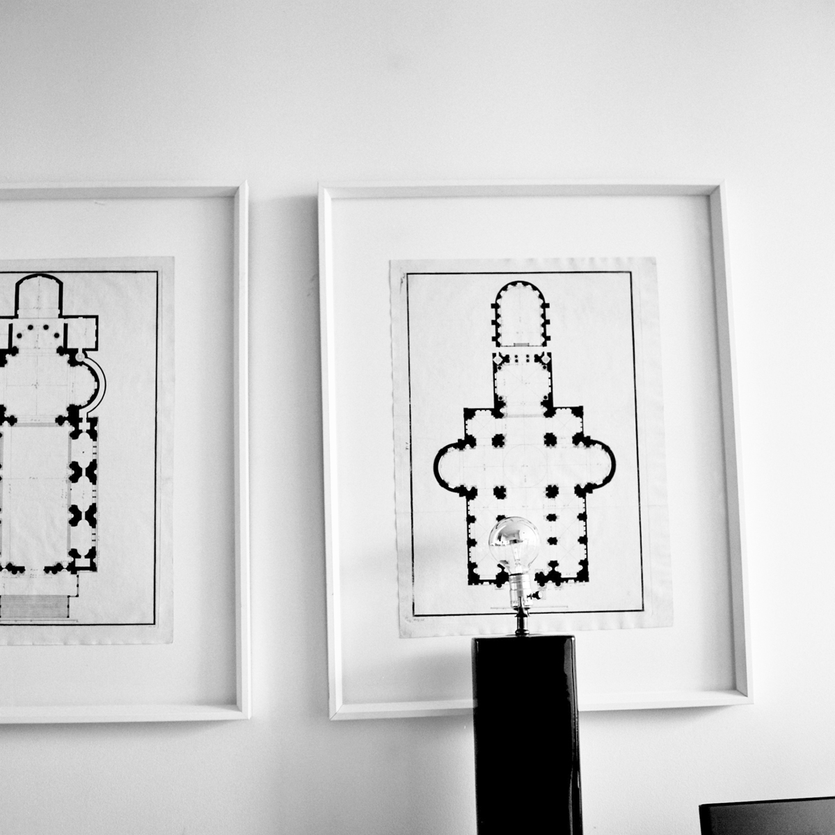 19th century prints depicting plans of two Palladio churches in Venice.
What’s your favorite period of architecture? Any period of the past will always be seen through a contemporary filter, so I would have to say the current one.
Do ugly buildings make you angry? I’m grateful for them. They’re often far more entertaining than those commonly accepted as “beautiful.”
Do you prefer order or chaos? I usually end up with the latter, which I then try to pass off as the former.
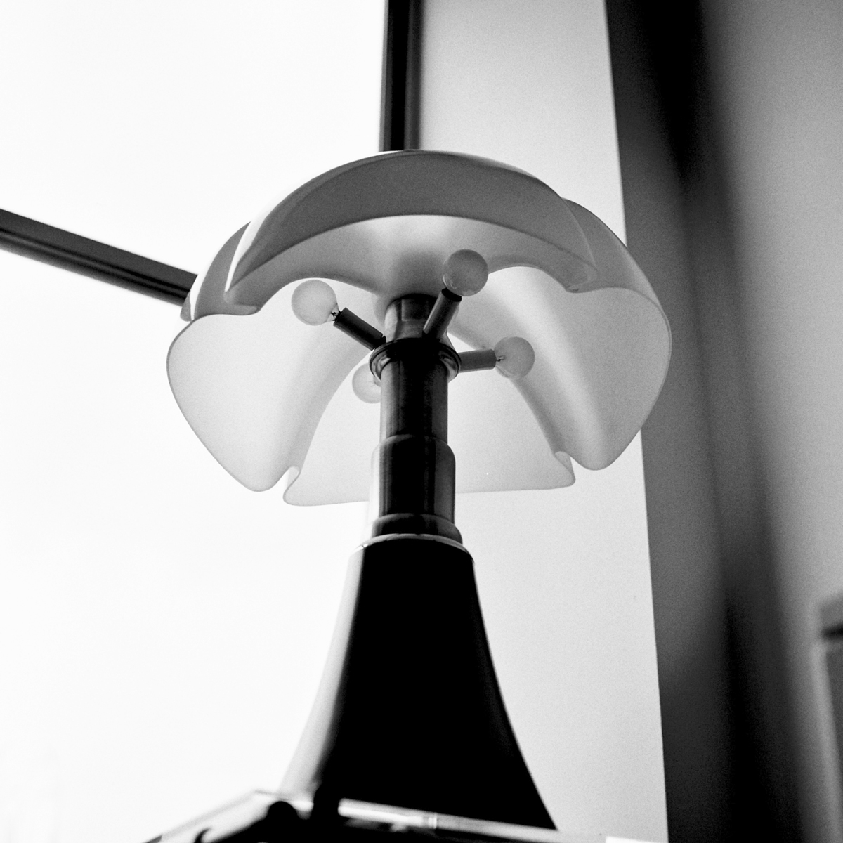
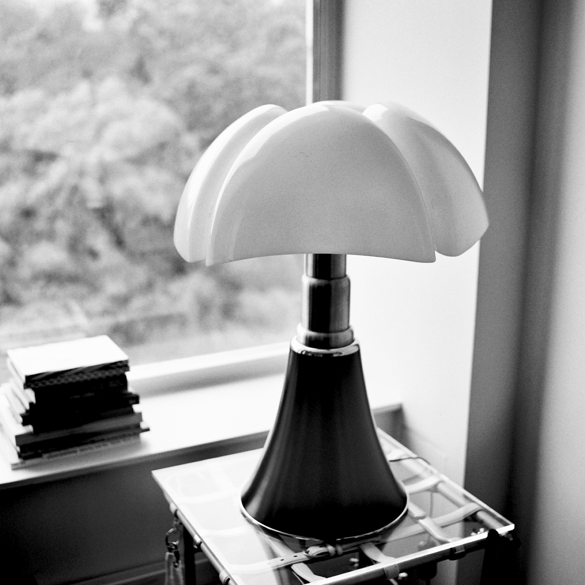 Pipistrello lamp by Gae Aulenti on table by Paul Kopkau.
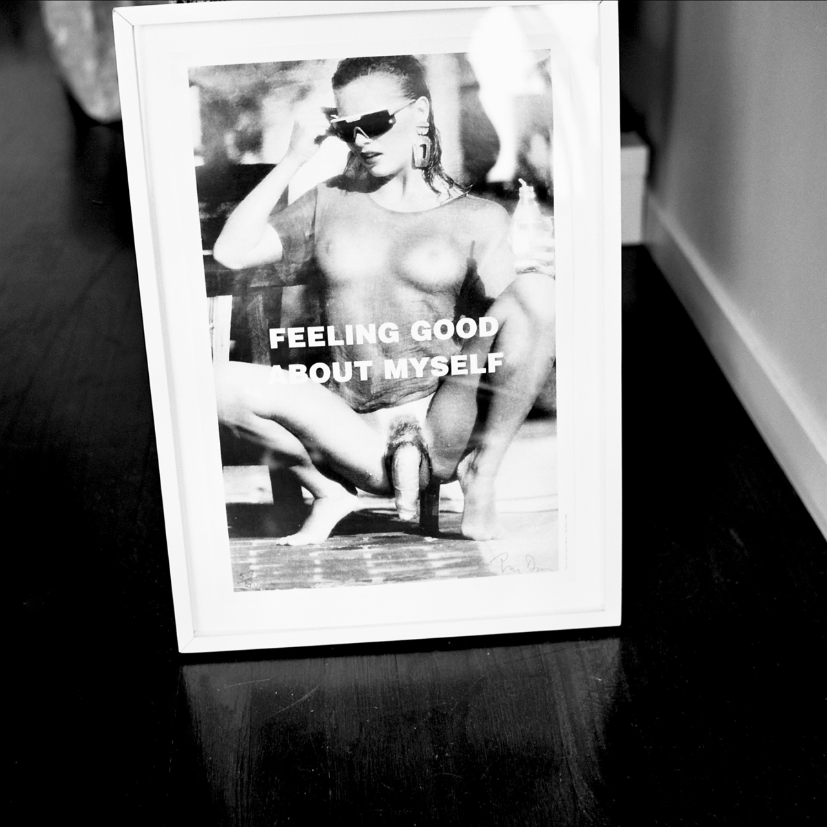 “Feeling Good About Myself” by Tom Dean.
Who inspires you? Anyone who can make a good living doing what they love.
What’s your favorite building in New York City? My home.
Could you be in a relationship with someone who has bad aesthetic taste? Only if he or she was amenable to letting me exert control over that part of the relationship.
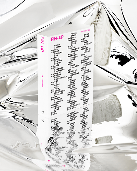
You recently finished the book PIN-UP Interviews (pictured above). You describe it as “a compilation of over 50 of the most fascinating interviews from PIN–UP magazine.” How did you select the interviews for the book? I would’ve love to print all of them, but the ones that didn’t make it were the ones that were the most time specific, most of the ones printed kind of have an universal aspect to them. If it would have been up to me, I would have included all of them.
How did you decide the order of the interviews in the book? Alphabetical, by last name.
Are you planning to do a book like this every number of issue? Maybe, it could be. I think the next book that I would like to do is something very visual. But, I am not ruling out another interview book.
Have you been planning to make this compilation for awhile? I’ve been wanting to do a book for a long time, I mean we’ve done 14 issues so far, we accumulated so much material over the years that after a while you get the urge to compile it. One of the things that PIN-UP is known for is for it’s cutting edge design, with this book the idea was to really turn down the volume design wise and turn up the volume in terms of the stories and personalities that have been featured in the magazine, to just let them shine without images, without gimmicks, to have something super simple.
It will encourage people to actually read all the interviews instead of just looking at the pictures… I hope they read it, I’m happy if they just put it in their coffee table and pretend they are reading it.
Are you the type of guy that collects magazines? Other than PIN-UP? I actually don’t have all the issues of PIN-UP, we don’t have issue 1, it’s very rare. If you have it I might have to buy it from you.
Why did you decide to use pink on the cover? Is it because you are gay…ha ha? It was always pink, it really was, there were many other options that were shown, but I was kind of married to pink… Part of it, I think it was because I really loved issue 6 and it has the same fluorescent pink, the cover that had Richard Meier and Dinasty (which is also an amazing combo). I always loved that cover and I wanted the same color for the book because it is very catchy. I knew it was going to be comparably a dry book because it’s all text and I thought it would be a nice thing…and because I’m gay. ha!
Your latest issue of PIN-UP magazine, issue 14, is focused on Brazil. What attracted you to do a Brazilian issue? 1. Witnessing first-hand a society in the midst of major socio-economic transformation. 2. Avoiding the cold winter months in New York. 3. The prospect of meeting good-looking Brazilian men.
Are Brazilian men really that hot or do you think they’re overrated? It really all depends on what it is that you rate them for.
Did you learn anything about Brazil that really surprised you? The food is surprisingly heavy and fattening.
What’s your favorite place in the world? Beds, beaches, empty stadiums, and showers. (Not necessarily in that order).
What other publications do you love besides your own? Too many to mention. I recently curated an exhibition about genre-defining magazines at the Haus der Kunst in Munich, which will be up until the end of October. It is called Paper Weight and it looks at independent print publishing between 2000 and now. The list of participating magazines — even if we had to cut it down from over 50 to 15 — gives a good idea of the many other magazines I love, and respect.
What’s your go-to cocktail? Vodka tonic. Or anything that has cucumber in it, really.
What’s the theme for the next issue? “Bourgeois Shenanigans”
