This Is Amit on his collaboration with Homoco and Tom of Finland
The artist Amit Greenberg discusses their three-way collaboration
INTERVIEW BY GAYLETTER
PHOTOGRAPHY BY MATTHEW GOLI AND ABI BENITEZ
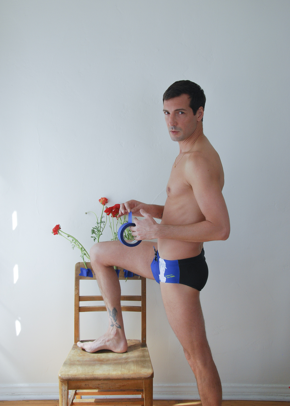
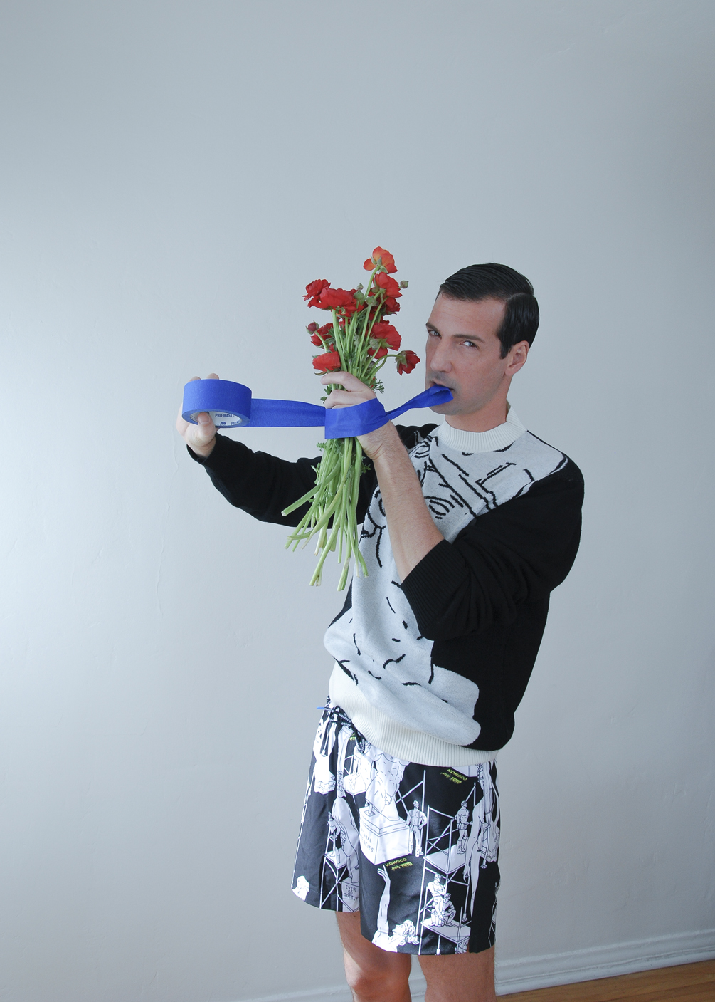
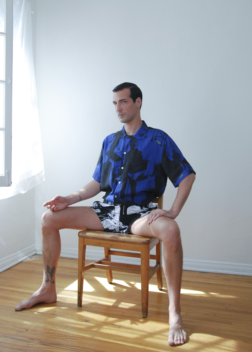
This is Amit at home in Los Angeles.
How did the three-way collaboration between Homoco, the Tom of Finland Foundation and you came about? This collaboration celebrates Tom’s art and legacy on his centennial birthday. Homoco founder Daniel DuGoff invited me to take on the creative challenge of creating art and developing a collection that reconciles Homoco’s mission as a brand for all queer people with Tom of Finland’s uniquely masculine world. I was honored to partake in this project, and the journey has been incredible.
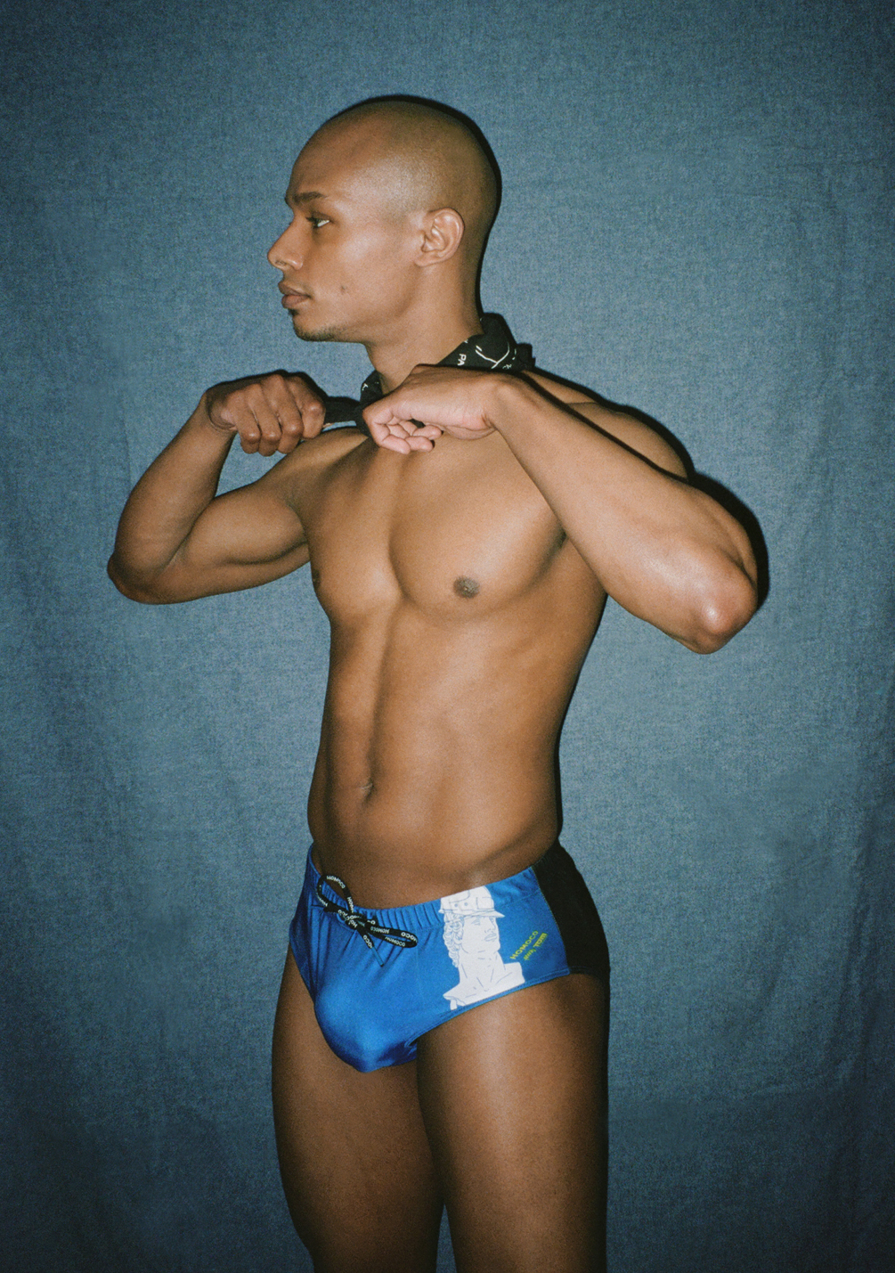
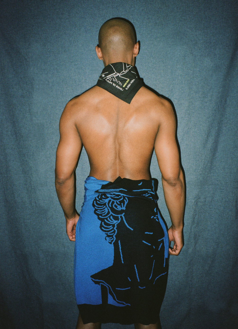
As for the outcome of the collaboration itself, I visited the Tom of Finland Foundation in LA. While exploring, I discovered some rare gems in the archive that inspired a full concept in my head. It started with a series of illustrations of “casual encounters” between working men that I haven’t seen before. Then, I found sketches of Michelangelo’s David drawn by Tom in his unique aesthetic. His sculpture study immediately brought to mind my latest exploration of classical eroticism.
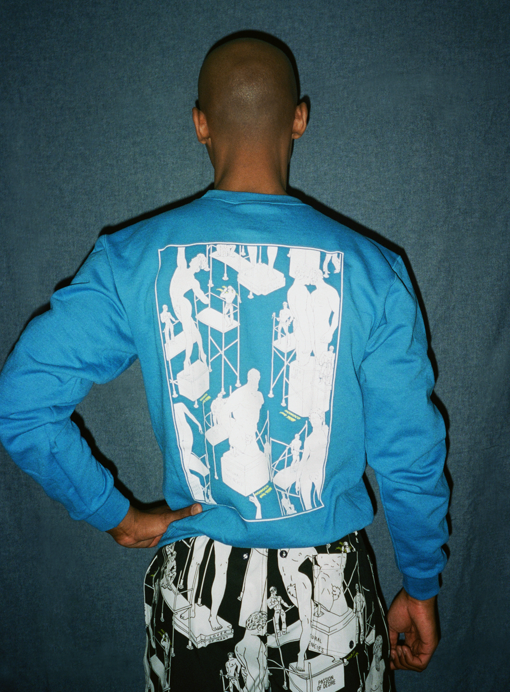
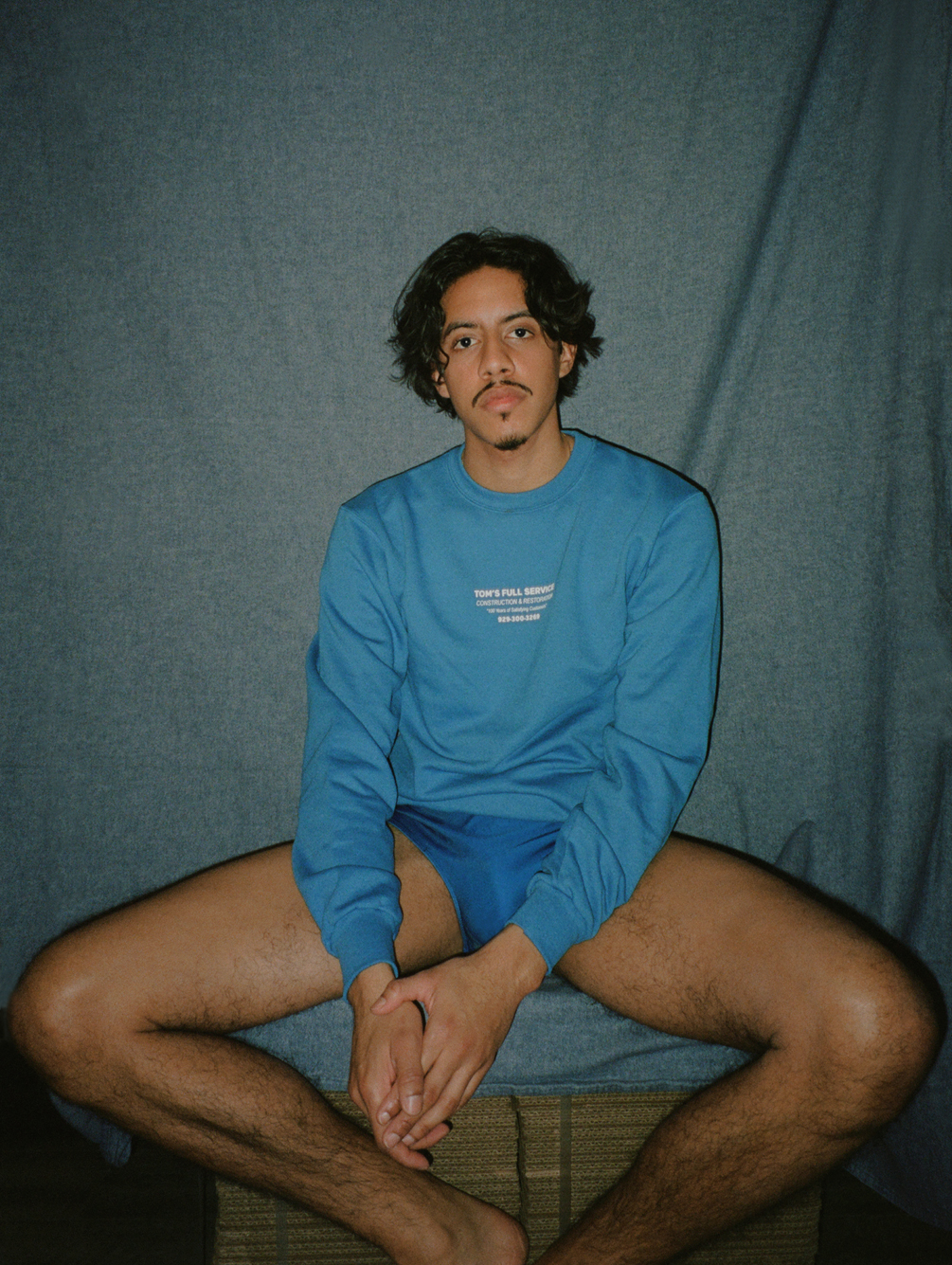
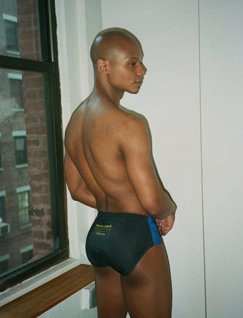
It was important for me to create an experience beyond a printed fabric. I wanted to bring some of Tom’s fantasy to life, so I conceptualized a fictional restoration and construction company, named “Tom’s Full Service,” which imagines the men from Tom’s illustrations as a team of construction workers, restoring classical-style statues. “Tom’s Full Service” construction company even has a working telephone number (929-300-3269) featuring a rare audio recording that I found in the archive.
How did you meet the designer Daniel DuGoff? I was very intrigued by Homoco when it first launched, and I ordered a few items from the first collection. I reached out to let Daniel know how much I love the designs, the product, the concept, and the brand’s philosophy. Once we connected, things just unfolded organically. We figured out we have a bunch of friends in common, we had a few Brooklyn hangouts, and we were both excited about the idea of creating something together when the time was right. That happened pretty fast, and the stars aligned perfectly for this collaboration.
What inspires your art? I think my subconscious registers things as inspiration pretty regularly. It seems like my ideas come from a very mystical abstract place or a problem-solving mindset. When I have a specific theme or material I need to explore, the inspiration can feel self-generated.
On a side note, I highly recommend listening to Elizabeth Gilbert’s book “Big Magic,” it helped me understand and embrace the process of befriending your creative ideas and inspirations but also being able to let some of them go.
What type of pen/markers do you use to draw? My latest and favorite is the most basic Paper Mate Felt Tip Pens, but I also love using the Apple Pencil for digital work.
Do you create constantly, or in bursts? What is your rhythm of creation? In my head, I create constantly, but materializing ideas happen to me mostly in bursts. I see myself as a multi-disciplinary maker, which lends itself to exploring all materials, concepts, and mediums to convey an experience or a message. When ideas start to crystallize, I go through many trials and errors until I create systems to produce a project. Sometimes it feels a bit like the trippy chess revelation scenes from The Queen Gambit; the dots start to connect.
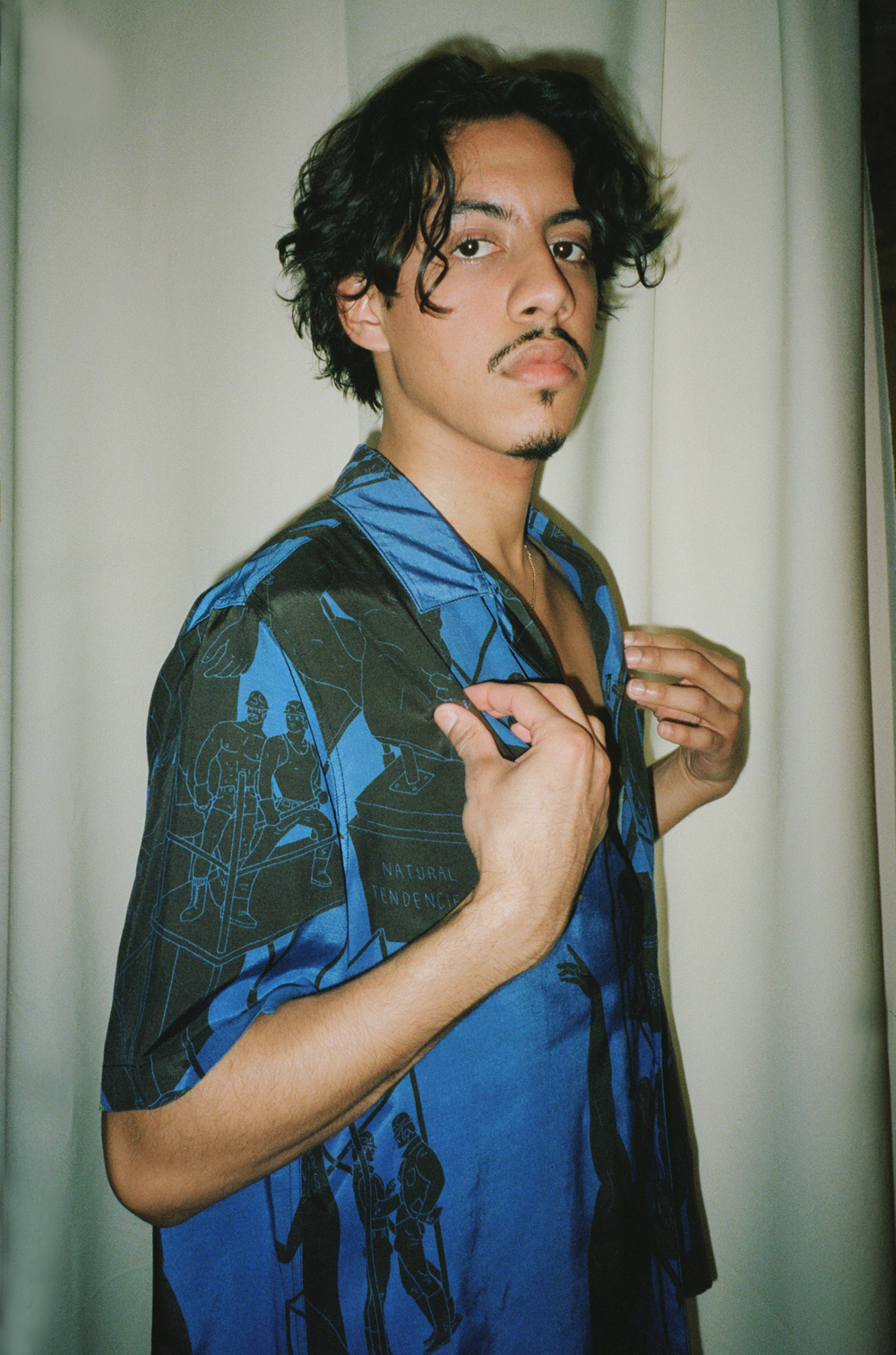
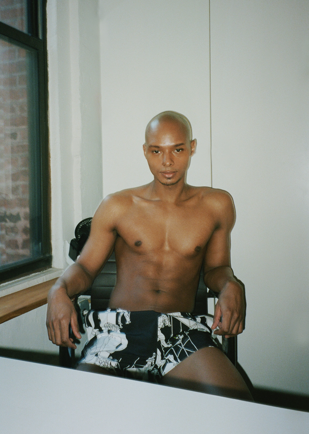
Can you tell us about the color choices for the collaboration? Each color I used in the designs holds significance focused on Tom’s world, work, and philosophy. The forest greens represent cruising in nature. The blacks and charcoal greys represent Tom’s ink and pencil drawings. The safety green and safety orange refer to construction workers’ uniforms. And the pinky peach is an allusion to the peach emoji.
The colors added to the second part of the collection are a wink (and maybe a whistle) to the working man. We took another step toward the fictional “Tom Full Service” construction company and designed the worker’s “uniform” with a touch of poetic sentiment. The added blue color, a signature color in my work, is a tribute to the famous french workwear “bleu de travail.”
What is the legacy of TOF in 2021? TOF legacy in 2021 has evolved and shifted the narrative from the idea of pure musicality into a more inclusive mindset, capturing the rise in consciousness we are experiencing in our community toward acceptance to all. In the collection, we have highlighted this new perspective by introducing Tom’s world to sculptures of queer figures in classical style, placing Tom’s Full-Service workers in a position to attend, examine, and admire the diversity of bodies.
What have you learned from the life and work of Tom of Finland? I realized that Tom’s work isn’t just erotic art; it is revolutionary for being one of the first moments since the Renaissance that men depicted in art as a sexualized object of desire and celebrated for its shape and form.
Do you have a favorite piece? I love the sweaters from the latest drop. Daniel took the collection to a whole other level by adding them. I also enjoy wearing the hoodies with the text pretty regularly.
How long did it take from start to finish to bring this collaboration to life? It’s been almost a year from concept to launch, with many things constantly changing and evolving. The first part of the collection got such an incredible response that we decided to push the second part even further the materials and the design.
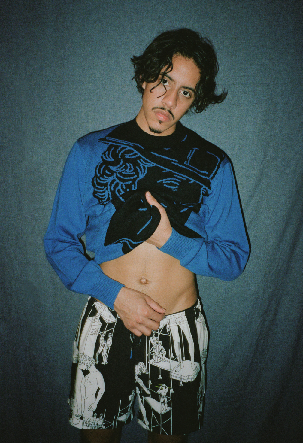
How did you guys come up with the text on the clothing? There are two kinds of texts on the clothing. One is the fictional “Tom Full Service” company workwear, for which Daniel and I looked at NYC construction companies workwear as a reference and added our own gay word twist. The second text is my poetic way of titling feelings and moments in time. I tend to use words in my art, I use them almost like a soundtrack to the visual.
What is one saying to the world by wearing these pieces? Hopefully that they celebrate their beautiful selves in the items we created.
Any future collaborations with the brand? When the right time comes again, we will for sure, but in the meantime, Homoco has some fun collaborations in the making with amazing queer artists. As for me, I am working on developing my own unique studio brand.
Where are you happiest? Where ever I create.
Where are you most excited to wear your fav pieces once the world opens? With friends on the beach in Tel Aviv !
Click here to buy the collection.
This is Amit at home in Los Angeles.
How did the three-way collaboration between Homoco, the Tom of Finland Foundation and you came about? This collaboration celebrates Tom’s art and legacy on his centennial birthday. Homoco founder Daniel DuGoff invited me to take on the creative challenge of creating art and developing a collection that reconciles Homoco’s mission as a brand for all queer people with Tom of Finland’s uniquely masculine world. I was honored to partake in this project, and the journey has been incredible.
As for the outcome of the collaboration itself, I visited the Tom of Finland Foundation in LA. While exploring, I discovered some rare gems in the archive that inspired a full concept in my head. It started with a series of illustrations of “casual encounters” between working men that I haven’t seen before. Then, I found sketches of Michelangelo’s David drawn by Tom in his unique aesthetic. His sculpture study immediately brought to mind my latest exploration of classical eroticism.
It was important for me to create an experience beyond a printed fabric. I wanted to bring some of Tom’s fantasy to life, so I conceptualized a fictional restoration and construction company, named “Tom’s Full Service,” which imagines the men from Tom’s illustrations as a team of construction workers, restoring classical-style statues. “Tom’s Full Service” construction company even has a working telephone number (929-300-3269) featuring a rare audio recording that I found in the archive.
How did you meet the designer Daniel DuGoff? I was very intrigued by Homoco when it first launched, and I ordered a few items from the first collection. I reached out to let Daniel know how much I love the designs, the product, the concept, and the brand’s philosophy. Once we connected, things just unfolded organically. We figured out we have a bunch of friends in common, we had a few Brooklyn hangouts, and we were both excited about the idea of creating something together when the time was right. That happened pretty fast, and the stars aligned perfectly for this collaboration.
What inspires your art? I think my subconscious registers things as inspiration pretty regularly. It seems like my ideas come from a very mystical abstract place or a problem-solving mindset. When I have a specific theme or material I need to explore, the inspiration can feel self-generated.
On a side note, I highly recommend listening to Elizabeth Gilbert’s book “Big Magic,” it helped me understand and embrace the process of befriending your creative ideas and inspirations but also being able to let some of them go.
What type of pen/markers do you use to draw? My latest and favorite is the most basic Paper Mate Felt Tip Pens, but I also love using the Apple Pencil for digital work.
Do you create constantly, or in bursts? What is your rhythm of creation? In my head, I create constantly, but materializing ideas happen to me mostly in bursts. I see myself as a multi-disciplinary maker, which lends itself to exploring all materials, concepts, and mediums to convey an experience or a message. When ideas start to crystallize, I go through many trials and errors until I create systems to produce a project. Sometimes it feels a bit like the trippy chess revelation scenes from The Queen Gambit; the dots start to connect.
Can you tell us about the color choices for the collaboration? Each color I used in the designs holds significance focused on Tom’s world, work, and philosophy. The forest greens represent cruising in nature. The blacks and charcoal greys represent Tom’s ink and pencil drawings. The safety green and safety orange refer to construction workers’ uniforms. And the pinky peach is an allusion to the peach emoji.
The colors added to the second part of the collection are a wink (and maybe a whistle) to the working man. We took another step toward the fictional “Tom Full Service” construction company and designed the worker’s “uniform” with a touch of poetic sentiment. The added blue color, a signature color in my work, is a tribute to the famous french workwear “bleu de travail.”
What is the legacy of TOF in 2021? TOF legacy in 2021 has evolved and shifted the narrative from the idea of pure musicality into a more inclusive mindset, capturing the rise in consciousness we are experiencing in our community toward acceptance to all. In the collection, we have highlighted this new perspective by introducing Tom’s world to sculptures of queer figures in classical style, placing Tom’s Full-Service workers in a position to attend, examine, and admire the diversity of bodies.
What have you learned from the life and work of Tom of Finland? I realized that Tom’s work isn’t just erotic art; it is revolutionary for being one of the first moments since the Renaissance that men depicted in art as a sexualized object of desire and celebrated for its shape and form.
Do you have a favorite piece? I love the sweaters from the latest drop. Daniel took the collection to a whole other level by adding them. I also enjoy wearing the hoodies with the text pretty regularly.
How long did it take from start to finish to bring this collaboration to life? It’s been almost a year from concept to launch, with many things constantly changing and evolving. The first part of the collection got such an incredible response that we decided to push the second part even further the materials and the design.
How did you guys come up with the text on the clothing? There are two kinds of texts on the clothing. One is the fictional “Tom Full Service” company workwear, for which Daniel and I looked at NYC construction companies workwear as a reference and added our own gay word twist. The second text is my poetic way of titling feelings and moments in time. I tend to use words in my art, I use them almost like a soundtrack to the visual.
What is one saying to the world by wearing these pieces? Hopefully that they celebrate their beautiful selves in the items we created.
Any future collaborations with the brand? When the right time comes again, we will for sure, but in the meantime, Homoco has some fun collaborations in the making with amazing queer artists. As for me, I am working on developing my own unique studio brand.
Where are you happiest? Where ever I create.
Where are you most excited to wear your fav pieces once the world opens? With friends on the beach in Tel Aviv !
Click here to buy the collection.
Nicholas
How did the three-way collaboration between Homoco, the Tom of Finland Foundation and you came about? This collaboration celebrates Tom’s art and legacy on his centennial birthday. Homoco founder Daniel DuGoff invited me to take on the creative challenge of creating art and developing a collection that reconciles Homoco’s mission as a brand for all queer people with Tom of Finland’s uniquely masculine world. I was honored to partake in this project, and the journey has been incredible.
As for the outcome of the collaboration itself, I visited the Tom of Finland Foundation in LA. While exploring, I discovered some rare gems in the archive that inspired a full concept in my head. It started with a series of illustrations of “casual encounters” between working men that I haven’t seen before. Then, I found sketches of Michelangelo’s David drawn by Tom in his unique aesthetic. His sculpture study immediately brought to mind my latest exploration of classical eroticism.
It was important for me to create an experience beyond a printed fabric. I wanted to bring some of Tom’s fantasy to life, so I conceptualized a fictional restoration and construction company, named “Tom’s Full Service,” which imagines the men from Tom’s illustrations as a team of construction workers, restoring classical-style statues. “Tom’s Full Service” construction company even has a working telephone number (929-300-3269) featuring a rare audio recording that I found in the archive.
How did you meet the designer Daniel DuGoff? I was very intrigued by Homoco when it first launched, and I ordered a few items from the first collection. I reached out to let Daniel know how much I love the designs, the product, the concept, and the brand’s philosophy. Once we connected, things just unfolded organically. We figured out we have a bunch of friends in common, we had a few Brooklyn hangouts, and we were both excited about the idea of creating something together when the time was right. That happened pretty fast, and the stars aligned perfectly for this collaboration.
What inspires your art? I think my subconscious registers things as inspiration pretty regularly. It seems like my ideas come from a very mystical abstract place or a problem-solving mindset. When I have a specific theme or material I need to explore, the inspiration can feel self-generated.
On a side note, I highly recommend listening to Elizabeth Gilbert’s book “Big Magic,” it helped me understand and embrace the process of befriending your creative ideas and inspirations but also being able to let some of them go.
What type of pen/markers do you use to draw? My latest and favorite is the most basic Paper Mate Felt Tip Pens, but I also love using the Apple Pencil for digital work.
Do you create constantly, or in bursts? What is your rhythm of creation? In my head, I create constantly, but materializing ideas happen to me mostly in bursts. I see myself as a multi-disciplinary maker, which lends itself to exploring all materials, concepts, and mediums to convey an experience or a message. When ideas start to crystallize, I go through many trials and errors until I create systems to produce a project. Sometimes it feels a bit like the trippy chess revelation scenes from The Queen Gambit; the dots start to connect.
Can you tell us about the color choices for the collaboration? Each color I used in the designs holds significance focused on Tom’s world, work, and philosophy. The forest greens represent cruising in nature. The blacks and charcoal greys represent Tom’s ink and pencil drawings. The safety green and safety orange refer to construction workers’ uniforms. And the pinky peach is an allusion to the peach emoji.
The colors added to the second part of the collection are a wink (and maybe a whistle) to the working man. We took another step toward the fictional “Tom Full Service” construction company and designed the worker’s “uniform” with a touch of poetic sentiment. The added blue color, a signature color in my work, is a tribute to the famous french workwear “bleu de travail.”
What is the legacy of TOF in 2021? TOF legacy in 2021 has evolved and shifted the narrative from the idea of pure musicality into a more inclusive mindset, capturing the rise in consciousness we are experiencing in our community toward acceptance to all. In the collection, we have highlighted this new perspective by introducing Tom’s world to sculptures of queer figures in classical style, placing Tom’s Full-Service workers in a position to attend, examine, and admire the diversity of bodies.
What have you learned from the life and work of Tom of Finland? I realized that Tom’s work isn’t just erotic art; it is revolutionary for being one of the first moments since the Renaissance that men depicted in art as a sexualized object of desire and celebrated for its shape and form.
Do you have a favorite piece? I love the sweaters from the latest drop. Daniel took the collection to a whole other level by adding them. I also enjoy wearing the hoodies with the text pretty regularly.
How long did it take from start to finish to bring this collaboration to life? It’s been almost a year from concept to launch, with many things constantly changing and evolving. The first part of the collection got such an incredible response that we decided to push the second part even further the materials and the design.
How did you guys come up with the text on the clothing? There are two kinds of texts on the clothing. One is the fictional “Tom Full Service” company workwear, for which Daniel and I looked at NYC construction companies workwear as a reference and added our own gay word twist. The second text is my poetic way of titling feelings and moments in time. I tend to use words in my art, I use them almost like a soundtrack to the visual.
What is one saying to the world by wearing these pieces? Hopefully that they celebrate their beautiful selves in the items we created.
Any future collaborations with the brand? When the right time comes again, we will for sure, but in the meantime, Homoco has some fun collaborations in the making with amazing queer artists. As for me, I am working on developing my own unique studio brand.
Where are you happiest? Where ever I create.
Where are you most excited to wear your fav pieces once the world opens? With friends on the beach in Tel Aviv !
Click here to buy the collection.
Abdier
How did the three-way collaboration between Homoco, the Tom of Finland Foundation and you came about? This collaboration celebrates Tom’s art and legacy on his centennial birthday. Homoco founder Daniel DuGoff invited me to take on the creative challenge of creating art and developing a collection that reconciles Homoco’s mission as a brand for all queer people with Tom of Finland’s uniquely masculine world. I was honored to partake in this project, and the journey has been incredible.
As for the outcome of the collaboration itself, I visited the Tom of Finland Foundation in LA. While exploring, I discovered some rare gems in the archive that inspired a full concept in my head. It started with a series of illustrations of “casual encounters” between working men that I haven’t seen before. Then, I found sketches of Michelangelo’s David drawn by Tom in his unique aesthetic. His sculpture study immediately brought to mind my latest exploration of classical eroticism.
It was important for me to create an experience beyond a printed fabric. I wanted to bring some of Tom’s fantasy to life, so I conceptualized a fictional restoration and construction company, named “Tom’s Full Service,” which imagines the men from Tom’s illustrations as a team of construction workers, restoring classical-style statues. “Tom’s Full Service” construction company even has a working telephone number (929-300-3269) featuring a rare audio recording that I found in the archive.
How did you meet the designer Daniel DuGoff? I was very intrigued by Homoco when it first launched, and I ordered a few items from the first collection. I reached out to let Daniel know how much I love the designs, the product, the concept, and the brand’s philosophy. Once we connected, things just unfolded organically. We figured out we have a bunch of friends in common, we had a few Brooklyn hangouts, and we were both excited about the idea of creating something together when the time was right. That happened pretty fast, and the stars aligned perfectly for this collaboration.
What inspires your art? I think my subconscious registers things as inspiration pretty regularly. It seems like my ideas come from a very mystical abstract place or a problem-solving mindset. When I have a specific theme or material I need to explore, the inspiration can feel self-generated.
On a side note, I highly recommend listening to Elizabeth Gilbert’s book “Big Magic,” it helped me understand and embrace the process of befriending your creative ideas and inspirations but also being able to let some of them go.
What type of pen/markers do you use to draw? My latest and favorite is the most basic Paper Mate Felt Tip Pens, but I also love using the Apple Pencil for digital work.
Do you create constantly, or in bursts? What is your rhythm of creation? In my head, I create constantly, but materializing ideas happen to me mostly in bursts. I see myself as a multi-disciplinary maker, which lends itself to exploring all materials, concepts, and mediums to convey an experience or a message. When ideas start to crystallize, I go through many trials and errors until I create systems to produce a project. Sometimes it feels a bit like the trippy chess revelation scenes from The Queen Gambit; the dots start to connect.
Can you tell us about the color choices for the collaboration? Each color I used in the designs holds significance focused on Tom’s world, work, and philosophy. The forest greens represent cruising in nature. The blacks and charcoal greys represent Tom’s ink and pencil drawings. The safety green and safety orange refer to construction workers’ uniforms. And the pinky peach is an allusion to the peach emoji.
The colors added to the second part of the collection are a wink (and maybe a whistle) to the working man. We took another step toward the fictional “Tom Full Service” construction company and designed the worker’s “uniform” with a touch of poetic sentiment. The added blue color, a signature color in my work, is a tribute to the famous french workwear “bleu de travail.”
What is the legacy of TOF in 2021? TOF legacy in 2021 has evolved and shifted the narrative from the idea of pure musicality into a more inclusive mindset, capturing the rise in consciousness we are experiencing in our community toward acceptance to all. In the collection, we have highlighted this new perspective by introducing Tom’s world to sculptures of queer figures in classical style, placing Tom’s Full-Service workers in a position to attend, examine, and admire the diversity of bodies.
What have you learned from the life and work of Tom of Finland? I realized that Tom’s work isn’t just erotic art; it is revolutionary for being one of the first moments since the Renaissance that men depicted in art as a sexualized object of desire and celebrated for its shape and form.
Do you have a favorite piece? I love the sweaters from the latest drop. Daniel took the collection to a whole other level by adding them. I also enjoy wearing the hoodies with the text pretty regularly.
How long did it take from start to finish to bring this collaboration to life? It’s been almost a year from concept to launch, with many things constantly changing and evolving. The first part of the collection got such an incredible response that we decided to push the second part even further the materials and the design.
How did you guys come up with the text on the clothing? There are two kinds of texts on the clothing. One is the fictional “Tom Full Service” company workwear, for which Daniel and I looked at NYC construction companies workwear as a reference and added our own gay word twist. The second text is my poetic way of titling feelings and moments in time. I tend to use words in my art, I use them almost like a soundtrack to the visual.
What is one saying to the world by wearing these pieces? Hopefully that they celebrate their beautiful selves in the items we created.
Any future collaborations with the brand? When the right time comes again, we will for sure, but in the meantime, Homoco has some fun collaborations in the making with amazing queer artists. As for me, I am working on developing my own unique studio brand.
Where are you happiest? Where ever I create.
Where are you most excited to wear your fav pieces once the world opens? With friends on the beach in Tel Aviv !
Click here to buy the collection.
Nicholas
How did the three-way collaboration between Homoco, the Tom of Finland Foundation and you came about? This collaboration celebrates Tom’s art and legacy on his centennial birthday. Homoco founder Daniel DuGoff invited me to take on the creative challenge of creating art and developing a collection that reconciles Homoco’s mission as a brand for all queer people with Tom of Finland’s uniquely masculine world. I was honored to partake in this project, and the journey has been incredible.
As for the outcome of the collaboration itself, I visited the Tom of Finland Foundation in LA. While exploring, I discovered some rare gems in the archive that inspired a full concept in my head. It started with a series of illustrations of “casual encounters” between working men that I haven’t seen before. Then, I found sketches of Michelangelo’s David drawn by Tom in his unique aesthetic. His sculpture study immediately brought to mind my latest exploration of classical eroticism.
It was important for me to create an experience beyond a printed fabric. I wanted to bring some of Tom’s fantasy to life, so I conceptualized a fictional restoration and construction company, named “Tom’s Full Service,” which imagines the men from Tom’s illustrations as a team of construction workers, restoring classical-style statues. “Tom’s Full Service” construction company even has a working telephone number (929-300-3269) featuring a rare audio recording that I found in the archive.
How did you meet the designer Daniel DuGoff? I was very intrigued by Homoco when it first launched, and I ordered a few items from the first collection. I reached out to let Daniel know how much I love the designs, the product, the concept, and the brand’s philosophy. Once we connected, things just unfolded organically. We figured out we have a bunch of friends in common, we had a few Brooklyn hangouts, and we were both excited about the idea of creating something together when the time was right. That happened pretty fast, and the stars aligned perfectly for this collaboration.
What inspires your art? I think my subconscious registers things as inspiration pretty regularly. It seems like my ideas come from a very mystical abstract place or a problem-solving mindset. When I have a specific theme or material I need to explore, the inspiration can feel self-generated.
On a side note, I highly recommend listening to Elizabeth Gilbert’s book “Big Magic,” it helped me understand and embrace the process of befriending your creative ideas and inspirations but also being able to let some of them go.
What type of pen/markers do you use to draw? My latest and favorite is the most basic Paper Mate Felt Tip Pens, but I also love using the Apple Pencil for digital work.
Do you create constantly, or in bursts? What is your rhythm of creation? In my head, I create constantly, but materializing ideas happen to me mostly in bursts. I see myself as a multi-disciplinary maker, which lends itself to exploring all materials, concepts, and mediums to convey an experience or a message. When ideas start to crystallize, I go through many trials and errors until I create systems to produce a project. Sometimes it feels a bit like the trippy chess revelation scenes from The Queen Gambit; the dots start to connect.
Can you tell us about the color choices for the collaboration? Each color I used in the designs holds significance focused on Tom’s world, work, and philosophy. The forest greens represent cruising in nature. The blacks and charcoal greys represent Tom’s ink and pencil drawings. The safety green and safety orange refer to construction workers’ uniforms. And the pinky peach is an allusion to the peach emoji.
The colors added to the second part of the collection are a wink (and maybe a whistle) to the working man. We took another step toward the fictional “Tom Full Service” construction company and designed the worker’s “uniform” with a touch of poetic sentiment. The added blue color, a signature color in my work, is a tribute to the famous french workwear “bleu de travail.”
What is the legacy of TOF in 2021? TOF legacy in 2021 has evolved and shifted the narrative from the idea of pure musicality into a more inclusive mindset, capturing the rise in consciousness we are experiencing in our community toward acceptance to all. In the collection, we have highlighted this new perspective by introducing Tom’s world to sculptures of queer figures in classical style, placing Tom’s Full-Service workers in a position to attend, examine, and admire the diversity of bodies.
What have you learned from the life and work of Tom of Finland? I realized that Tom’s work isn’t just erotic art; it is revolutionary for being one of the first moments since the Renaissance that men depicted in art as a sexualized object of desire and celebrated for its shape and form.
Do you have a favorite piece? I love the sweaters from the latest drop. Daniel took the collection to a whole other level by adding them. I also enjoy wearing the hoodies with the text pretty regularly.
How long did it take from start to finish to bring this collaboration to life? It’s been almost a year from concept to launch, with many things constantly changing and evolving. The first part of the collection got such an incredible response that we decided to push the second part even further the materials and the design.
How did you guys come up with the text on the clothing? There are two kinds of texts on the clothing. One is the fictional “Tom Full Service” company workwear, for which Daniel and I looked at NYC construction companies workwear as a reference and added our own gay word twist. The second text is my poetic way of titling feelings and moments in time. I tend to use words in my art, I use them almost like a soundtrack to the visual.
What is one saying to the world by wearing these pieces? Hopefully that they celebrate their beautiful selves in the items we created.
Any future collaborations with the brand? When the right time comes again, we will for sure, but in the meantime, Homoco has some fun collaborations in the making with amazing queer artists. As for me, I am working on developing my own unique studio brand.
Where are you happiest? Where ever I create.
Where are you most excited to wear your fav pieces once the world opens? With friends on the beach in Tel Aviv !
Click here to buy the collection.
Abdier
How did the three-way collaboration between Homoco, the Tom of Finland Foundation and you came about? This collaboration celebrates Tom’s art and legacy on his centennial birthday. Homoco founder Daniel DuGoff invited me to take on the creative challenge of creating art and developing a collection that reconciles Homoco’s mission as a brand for all queer people with Tom of Finland’s uniquely masculine world. I was honored to partake in this project, and the journey has been incredible.
As for the outcome of the collaboration itself, I visited the Tom of Finland Foundation in LA. While exploring, I discovered some rare gems in the archive that inspired a full concept in my head. It started with a series of illustrations of “casual encounters” between working men that I haven’t seen before. Then, I found sketches of Michelangelo’s David drawn by Tom in his unique aesthetic. His sculpture study immediately brought to mind my latest exploration of classical eroticism.
It was important for me to create an experience beyond a printed fabric. I wanted to bring some of Tom’s fantasy to life, so I conceptualized a fictional restoration and construction company, named “Tom’s Full Service,” which imagines the men from Tom’s illustrations as a team of construction workers, restoring classical-style statues. “Tom’s Full Service” construction company even has a working telephone number (929-300-3269) featuring a rare audio recording that I found in the archive.
How did you meet the designer Daniel DuGoff? I was very intrigued by Homoco when it first launched, and I ordered a few items from the first collection. I reached out to let Daniel know how much I love the designs, the product, the concept, and the brand’s philosophy. Once we connected, things just unfolded organically. We figured out we have a bunch of friends in common, we had a few Brooklyn hangouts, and we were both excited about the idea of creating something together when the time was right. That happened pretty fast, and the stars aligned perfectly for this collaboration.
What inspires your art? I think my subconscious registers things as inspiration pretty regularly. It seems like my ideas come from a very mystical abstract place or a problem-solving mindset. When I have a specific theme or material I need to explore, the inspiration can feel self-generated.
On a side note, I highly recommend listening to Elizabeth Gilbert’s book “Big Magic,” it helped me understand and embrace the process of befriending your creative ideas and inspirations but also being able to let some of them go.
What type of pen/markers do you use to draw? My latest and favorite is the most basic Paper Mate Felt Tip Pens, but I also love using the Apple Pencil for digital work.
Do you create constantly, or in bursts? What is your rhythm of creation? In my head, I create constantly, but materializing ideas happen to me mostly in bursts. I see myself as a multi-disciplinary maker, which lends itself to exploring all materials, concepts, and mediums to convey an experience or a message. When ideas start to crystallize, I go through many trials and errors until I create systems to produce a project. Sometimes it feels a bit like the trippy chess revelation scenes from The Queen Gambit; the dots start to connect.
Can you tell us about the color choices for the collaboration? Each color I used in the designs holds significance focused on Tom’s world, work, and philosophy. The forest greens represent cruising in nature. The blacks and charcoal greys represent Tom’s ink and pencil drawings. The safety green and safety orange refer to construction workers’ uniforms. And the pinky peach is an allusion to the peach emoji.
The colors added to the second part of the collection are a wink (and maybe a whistle) to the working man. We took another step toward the fictional “Tom Full Service” construction company and designed the worker’s “uniform” with a touch of poetic sentiment. The added blue color, a signature color in my work, is a tribute to the famous french workwear “bleu de travail.”
What is the legacy of TOF in 2021? TOF legacy in 2021 has evolved and shifted the narrative from the idea of pure musicality into a more inclusive mindset, capturing the rise in consciousness we are experiencing in our community toward acceptance to all. In the collection, we have highlighted this new perspective by introducing Tom’s world to sculptures of queer figures in classical style, placing Tom’s Full-Service workers in a position to attend, examine, and admire the diversity of bodies.
What have you learned from the life and work of Tom of Finland? I realized that Tom’s work isn’t just erotic art; it is revolutionary for being one of the first moments since the Renaissance that men depicted in art as a sexualized object of desire and celebrated for its shape and form.
Do you have a favorite piece? I love the sweaters from the latest drop. Daniel took the collection to a whole other level by adding them. I also enjoy wearing the hoodies with the text pretty regularly.
How long did it take from start to finish to bring this collaboration to life? It’s been almost a year from concept to launch, with many things constantly changing and evolving. The first part of the collection got such an incredible response that we decided to push the second part even further the materials and the design.
How did you guys come up with the text on the clothing? There are two kinds of texts on the clothing. One is the fictional “Tom Full Service” company workwear, for which Daniel and I looked at NYC construction companies workwear as a reference and added our own gay word twist. The second text is my poetic way of titling feelings and moments in time. I tend to use words in my art, I use them almost like a soundtrack to the visual.
What is one saying to the world by wearing these pieces? Hopefully that they celebrate their beautiful selves in the items we created.
Any future collaborations with the brand? When the right time comes again, we will for sure, but in the meantime, Homoco has some fun collaborations in the making with amazing queer artists. As for me, I am working on developing my own unique studio brand.
Where are you happiest? Where ever I create.
Where are you most excited to wear your fav pieces once the world opens? With friends on the beach in Tel Aviv !
Click here to buy the collection.
Nicholas
How did the three-way collaboration between Homoco, the Tom of Finland Foundation and you came about? This collaboration celebrates Tom’s art and legacy on his centennial birthday. Homoco founder Daniel DuGoff invited me to take on the creative challenge of creating art and developing a collection that reconciles Homoco’s mission as a brand for all queer people with Tom of Finland’s uniquely masculine world. I was honored to partake in this project, and the journey has been incredible.
As for the outcome of the collaboration itself, I visited the Tom of Finland Foundation in LA. While exploring, I discovered some rare gems in the archive that inspired a full concept in my head. It started with a series of illustrations of “casual encounters” between working men that I haven’t seen before. Then, I found sketches of Michelangelo’s David drawn by Tom in his unique aesthetic. His sculpture study immediately brought to mind my latest exploration of classical eroticism.
It was important for me to create an experience beyond a printed fabric. I wanted to bring some of Tom’s fantasy to life, so I conceptualized a fictional restoration and construction company, named “Tom’s Full Service,” which imagines the men from Tom’s illustrations as a team of construction workers, restoring classical-style statues. “Tom’s Full Service” construction company even has a working telephone number (929-300-3269) featuring a rare audio recording that I found in the archive.
How did you meet the designer Daniel DuGoff? I was very intrigued by Homoco when it first launched, and I ordered a few items from the first collection. I reached out to let Daniel know how much I love the designs, the product, the concept, and the brand’s philosophy. Once we connected, things just unfolded organically. We figured out we have a bunch of friends in common, we had a few Brooklyn hangouts, and we were both excited about the idea of creating something together when the time was right. That happened pretty fast, and the stars aligned perfectly for this collaboration.
What inspires your art? I think my subconscious registers things as inspiration pretty regularly. It seems like my ideas come from a very mystical abstract place or a problem-solving mindset. When I have a specific theme or material I need to explore, the inspiration can feel self-generated.
On a side note, I highly recommend listening to Elizabeth Gilbert’s book “Big Magic,” it helped me understand and embrace the process of befriending your creative ideas and inspirations but also being able to let some of them go.
What type of pen/markers do you use to draw? My latest and favorite is the most basic Paper Mate Felt Tip Pens, but I also love using the Apple Pencil for digital work.
Do you create constantly, or in bursts? What is your rhythm of creation? In my head, I create constantly, but materializing ideas happen to me mostly in bursts. I see myself as a multi-disciplinary maker, which lends itself to exploring all materials, concepts, and mediums to convey an experience or a message. When ideas start to crystallize, I go through many trials and errors until I create systems to produce a project. Sometimes it feels a bit like the trippy chess revelation scenes from The Queen Gambit; the dots start to connect.
Can you tell us about the color choices for the collaboration? Each color I used in the designs holds significance focused on Tom’s world, work, and philosophy. The forest greens represent cruising in nature. The blacks and charcoal greys represent Tom’s ink and pencil drawings. The safety green and safety orange refer to construction workers’ uniforms. And the pinky peach is an allusion to the peach emoji.
The colors added to the second part of the collection are a wink (and maybe a whistle) to the working man. We took another step toward the fictional “Tom Full Service” construction company and designed the worker’s “uniform” with a touch of poetic sentiment. The added blue color, a signature color in my work, is a tribute to the famous french workwear “bleu de travail.”
What is the legacy of TOF in 2021? TOF legacy in 2021 has evolved and shifted the narrative from the idea of pure musicality into a more inclusive mindset, capturing the rise in consciousness we are experiencing in our community toward acceptance to all. In the collection, we have highlighted this new perspective by introducing Tom’s world to sculptures of queer figures in classical style, placing Tom’s Full-Service workers in a position to attend, examine, and admire the diversity of bodies.
What have you learned from the life and work of Tom of Finland? I realized that Tom’s work isn’t just erotic art; it is revolutionary for being one of the first moments since the Renaissance that men depicted in art as a sexualized object of desire and celebrated for its shape and form.
Do you have a favorite piece? I love the sweaters from the latest drop. Daniel took the collection to a whole other level by adding them. I also enjoy wearing the hoodies with the text pretty regularly.
How long did it take from start to finish to bring this collaboration to life? It’s been almost a year from concept to launch, with many things constantly changing and evolving. The first part of the collection got such an incredible response that we decided to push the second part even further the materials and the design.
How did you guys come up with the text on the clothing? There are two kinds of texts on the clothing. One is the fictional “Tom Full Service” company workwear, for which Daniel and I looked at NYC construction companies workwear as a reference and added our own gay word twist. The second text is my poetic way of titling feelings and moments in time. I tend to use words in my art, I use them almost like a soundtrack to the visual.
What is one saying to the world by wearing these pieces? Hopefully that they celebrate their beautiful selves in the items we created.
Any future collaborations with the brand? When the right time comes again, we will for sure, but in the meantime, Homoco has some fun collaborations in the making with amazing queer artists. As for me, I am working on developing my own unique studio brand.
Where are you happiest? Where ever I create.
Where are you most excited to wear your fav pieces once the world opens? With friends on the beach in Tel Aviv !
Click here to buy the collection.
Abdier
How did the three-way collaboration between Homoco, the Tom of Finland Foundation and you came about? This collaboration celebrates Tom’s art and legacy on his centennial birthday. Homoco founder Daniel DuGoff invited me to take on the creative challenge of creating art and developing a collection that reconciles Homoco’s mission as a brand for all queer people with Tom of Finland’s uniquely masculine world. I was honored to partake in this project, and the journey has been incredible.
As for the outcome of the collaboration itself, I visited the Tom of Finland Foundation in LA. While exploring, I discovered some rare gems in the archive that inspired a full concept in my head. It started with a series of illustrations of “casual encounters” between working men that I haven’t seen before. Then, I found sketches of Michelangelo’s David drawn by Tom in his unique aesthetic. His sculpture study immediately brought to mind my latest exploration of classical eroticism.
It was important for me to create an experience beyond a printed fabric. I wanted to bring some of Tom’s fantasy to life, so I conceptualized a fictional restoration and construction company, named “Tom’s Full Service,” which imagines the men from Tom’s illustrations as a team of construction workers, restoring classical-style statues. “Tom’s Full Service” construction company even has a working telephone number (929-300-3269) featuring a rare audio recording that I found in the archive.
How did you meet the designer Daniel DuGoff? I was very intrigued by Homoco when it first launched, and I ordered a few items from the first collection. I reached out to let Daniel know how much I love the designs, the product, the concept, and the brand’s philosophy. Once we connected, things just unfolded organically. We figured out we have a bunch of friends in common, we had a few Brooklyn hangouts, and we were both excited about the idea of creating something together when the time was right. That happened pretty fast, and the stars aligned perfectly for this collaboration.
What inspires your art? I think my subconscious registers things as inspiration pretty regularly. It seems like my ideas come from a very mystical abstract place or a problem-solving mindset. When I have a specific theme or material I need to explore, the inspiration can feel self-generated.
On a side note, I highly recommend listening to Elizabeth Gilbert’s book “Big Magic,” it helped me understand and embrace the process of befriending your creative ideas and inspirations but also being able to let some of them go.
What type of pen/markers do you use to draw? My latest and favorite is the most basic Paper Mate Felt Tip Pens, but I also love using the Apple Pencil for digital work.
Do you create constantly, or in bursts? What is your rhythm of creation? In my head, I create constantly, but materializing ideas happen to me mostly in bursts. I see myself as a multi-disciplinary maker, which lends itself to exploring all materials, concepts, and mediums to convey an experience or a message. When ideas start to crystallize, I go through many trials and errors until I create systems to produce a project. Sometimes it feels a bit like the trippy chess revelation scenes from The Queen Gambit; the dots start to connect.
Can you tell us about the color choices for the collaboration? Each color I used in the designs holds significance focused on Tom’s world, work, and philosophy. The forest greens represent cruising in nature. The blacks and charcoal greys represent Tom’s ink and pencil drawings. The safety green and safety orange refer to construction workers’ uniforms. And the pinky peach is an allusion to the peach emoji.
The colors added to the second part of the collection are a wink (and maybe a whistle) to the working man. We took another step toward the fictional “Tom Full Service” construction company and designed the worker’s “uniform” with a touch of poetic sentiment. The added blue color, a signature color in my work, is a tribute to the famous french workwear “bleu de travail.”
What is the legacy of TOF in 2021? TOF legacy in 2021 has evolved and shifted the narrative from the idea of pure musicality into a more inclusive mindset, capturing the rise in consciousness we are experiencing in our community toward acceptance to all. In the collection, we have highlighted this new perspective by introducing Tom’s world to sculptures of queer figures in classical style, placing Tom’s Full-Service workers in a position to attend, examine, and admire the diversity of bodies.
What have you learned from the life and work of Tom of Finland? I realized that Tom’s work isn’t just erotic art; it is revolutionary for being one of the first moments since the Renaissance that men depicted in art as a sexualized object of desire and celebrated for its shape and form.
Do you have a favorite piece? I love the sweaters from the latest drop. Daniel took the collection to a whole other level by adding them. I also enjoy wearing the hoodies with the text pretty regularly.
How long did it take from start to finish to bring this collaboration to life? It’s been almost a year from concept to launch, with many things constantly changing and evolving. The first part of the collection got such an incredible response that we decided to push the second part even further the materials and the design.
How did you guys come up with the text on the clothing? There are two kinds of texts on the clothing. One is the fictional “Tom Full Service” company workwear, for which Daniel and I looked at NYC construction companies workwear as a reference and added our own gay word twist. The second text is my poetic way of titling feelings and moments in time. I tend to use words in my art, I use them almost like a soundtrack to the visual.
What is one saying to the world by wearing these pieces? Hopefully that they celebrate their beautiful selves in the items we created.
Any future collaborations with the brand? When the right time comes again, we will for sure, but in the meantime, Homoco has some fun collaborations in the making with amazing queer artists. As for me, I am working on developing my own unique studio brand.
Where are you happiest? Where ever I create.
Where are you most excited to wear your fav pieces once the world opens? With friends on the beach in Tel Aviv !
Click here to buy the collection.
1/13